In the latest release of macOS Golden Gate, Apple has finally withdrawn its previous design choice of forcing icons for almost every menu command in macOS Tahoe, and the system menu has returned to a pure text style. This change is regarded by many users as a correction to the usability and readability of the interface.
In macOS Tahoe, under the leadership of the human-computer interface team, Apple has added SF Symbols icons to every menu item, ranging from gears to squares and pencils. It seems to be "more informative", but it is contrary to Apple's early self-defined human-computer interface design guidelines. Since graphic elements appear on the left side of each line of text, the user's brain will treat these small icons as part of the text when browsing the menu. It is difficult to quickly distinguish or locate commands through visual focus, and the icons are "in name only".
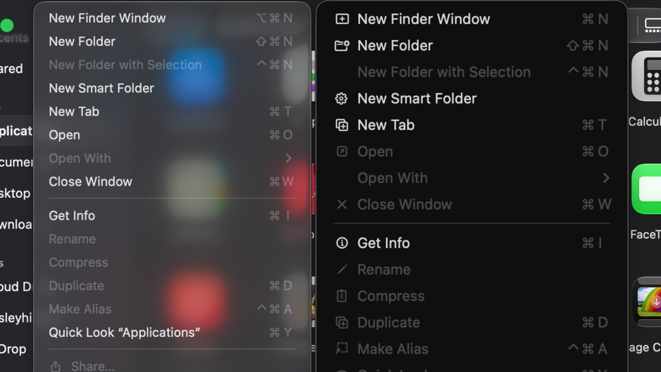
With the resignation of the senior executive responsible for this design line, Apple quietly reversed this decision when it announced macOS Golden Gate at WWDC 2026: the menu interface of the new version of the system returned to pure text form, canceled the itemized menu icons, and the interface look and feel was closer to the traditional style of past generations of macOS. In the comparison screenshots shown by the media, the left side is the simple menu without icons in Golden Gate, and the right side is the menu densely packed with icons in Tahoe era. The comparison between the two intuitively highlights the difference in information density and readability.
Apple mentioned "responding to user feedback" many times in this WWDC keynote speech. It not only adjusted the menu icons on macOS Golden Gate, but also made corrections on interface details such as inconsistent window fillet radius, trying to resolve the previous controversy surrounding the "Liquid Glass (Liquid Glass)" visual style. The design language introduced by macOS Tahoe has obvious changes in terms of interface transparency and quasi-object gloss, but has been criticized by many experienced users as "fancy but hindering use." Apple has since quickly corrected criticized design errors such as the Finder icon color matching.
Although the elimination of menu icons is just one of many adjustments, it is seen as a clear signal that Apple is returning to pragmatism in desktop interface design. From the outside, as macOS 27 Golden Gate opens to developers and test users, Apple will continue to make further fine-tuning at the human-machine interface level, and the trade-offs and compromises surrounding the Liquid Glass visual style are likely to become one of the important highlights of macOS iterations in the next few versions.