Google has been rolling out new icon designs using gradient styles since the end of 2025, and now this visual language is being further extended to more of its own applications. According to reports, 9to5Google has obtained a batch of new icon images. These new designs no longer follow the unified circular base plan of the past - the old plan tried to stuff all of Google's iconic colors within a circular frame, while the new version has clearly shifted to a softer and more diverse expression.
From the overall look and feel, the corners of the new icon are more rounded, and the color transition is smoother. The gradient effect naturally transitions from a light color similar to pastel to Google's higher saturation main color. In fact, this new design language has already appeared in the new version of Google’s “G” logo, as well as products such as Gemini, Google Photos and Google Maps. According to 9to5Google, this change is also seen as a manifestation of Google’s strengthening of the presence of artificial intelligence functions in its products.
The report believes that these new icons are more lively, distinct, and varied in style, echoing the retreat from the "flat minimalist style" in recent design trends. Compared with the relatively single, flat visual scheme that was popular in the late 2010s and early 2020s, Google is clearly pushing for a more layered and recognizable interface image.
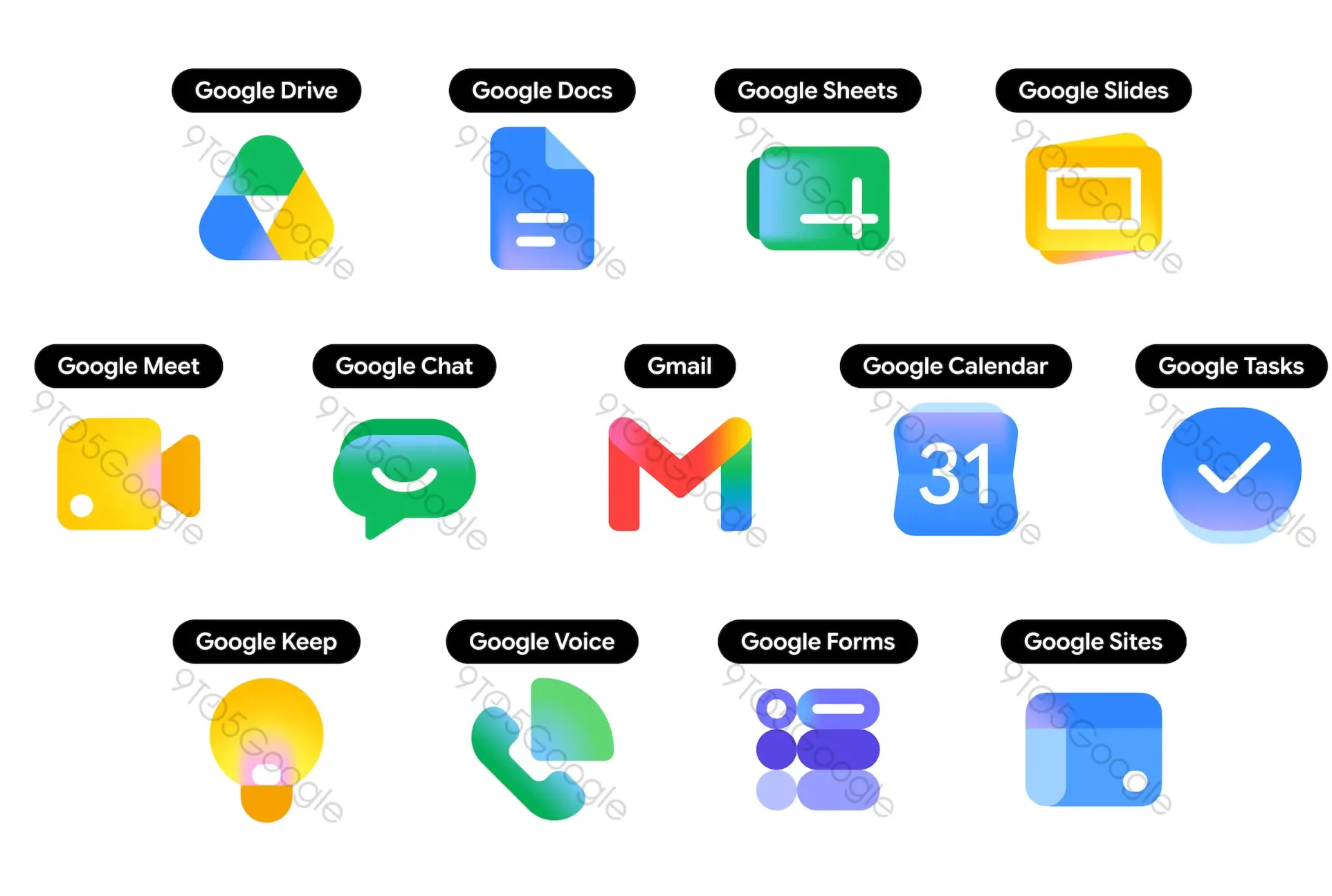
At the specific application level, products such as Google Sheets, Slides, Forms, Sites and Keep have all abandoned the previous "vertical paper" icon shape, and many of the new icons have adopted a horizontal layout. The article pointed out that this change is actually more in line with the actual use scenarios of these applications, especially the slide tool which is more suitable for horizontal display, rather than the visual cues of the past that approximated vertical documents.
Most of the icons in this round of updates have been improved. Not only are they easier to distinguish from each other, but many icons have begun to highlight a single main color. For example, the icon of Google Chat has been changed from the original four-color outlined dialogue bubble to a graphic with a green body and a smile element inside. The overall feeling is reminiscent of the early Google Hangouts icon. However, the author of the article also mentioned that Keep’s new icon is an exception, and in his opinion the visual effect is quite poor.
As for when these new icons will be officially pushed to users on a large scale, the report pointed out that there is currently no clear timetable, but considering that the relevant designs have already appeared on multiple products, it is likely that users will not have to wait too long for the full launch.