The Coca-Cola Company officially announced the launch of a new visual system on July 20 as part of its global brand refresh plan covering packaging, retail terminals, vending machines and digital platforms. This upgrade covers more than 200 markets around the world and aims to make the brand image more unified and clear.
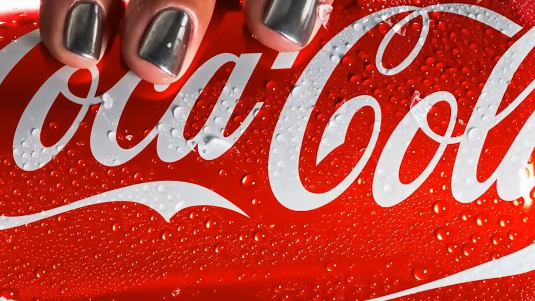
Although the appearance has been adjusted, Coca-Cola has not abandoned its iconic red can and classic handwritten logo. The refresh further highlights the brand’s classic visual assets, including the red and white color scheme, the iconic Spencer font, the iconic “dynamic ribbon” and the Arden Square design element.
"This refresh is designed to make our brand presentation clearer and more consistent, no matter where consumers experience our products," said Arnab Roy, global category president of Coca-Cola.
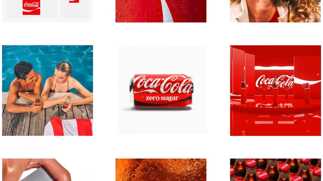
According to "Transform" magazine, brand design agency JKR was responsible for creating the new global visual identity system, while the packaging system was reworked by design studio The Superultrarare.
In this refresh, the packaging changes of Coca-Cola Zero Sugar are the most significant. The new cans feature the "Zero Sugar" logo in a larger font and are paired with a striking black version of the "Dynamic Ribbon" pattern. At the same time, the plastic bottled version will have a black cap to make it easier to distinguish it from the classic red bottle of regular Coke.
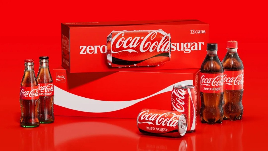
Although the visual elements have been updated, Coca-Cola emphasized that this adjustment is not to create a new logo or completely replace the existing brand image, but to give different versions of Coke products a stronger sense of family unity on the shelves.
Rapha Abreu, Coca-Cola’s head of design, revealed that the brief for this design brief was very simple – “to make Coca-Cola look more like Coca-Cola anywhere in the world.” This concept runs through the entire brand refresh.