
Abstract:
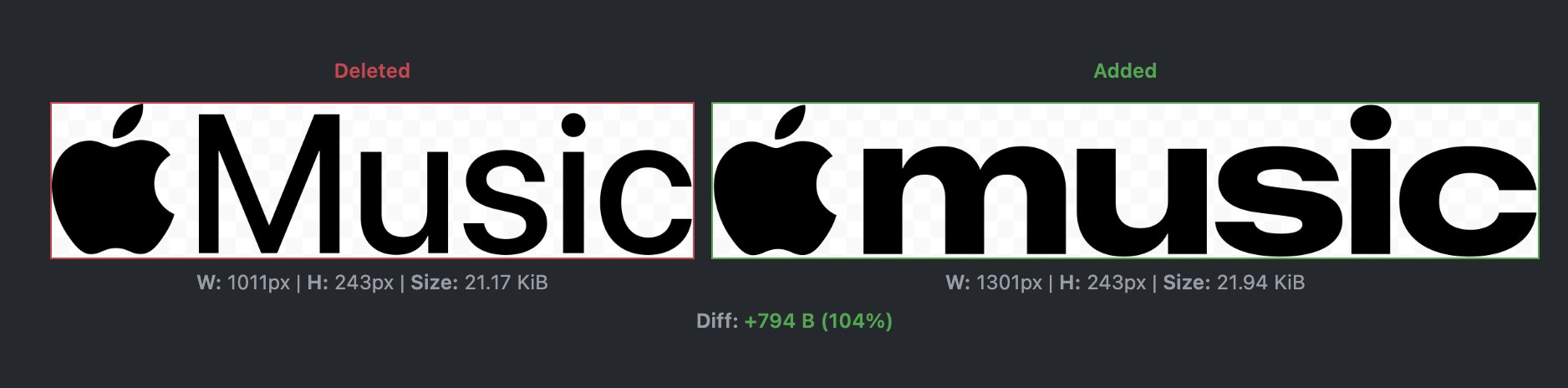
Apple is replacing Apple Music’s first logo since the service was launched in 2015. The latest developer beta version of macOS 27.2 shows that Apple has redesigned the Apple Music text logo, changing the original "Music" to a thicker font, and using all lowercase letters, making the overall visual more eye-catching and wider.
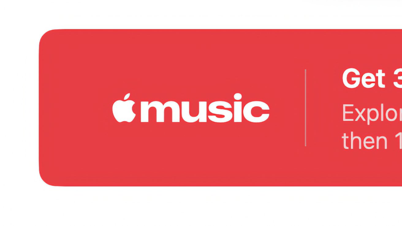
This change first appeared in macOS 27.2 Beta 3 and was later discovered in iOS 27.2 Beta 3. The relevant changes are not simply adjusting the font size, but directly changing the font style of the logo. The new "music" uses a significantly thicker font, and at the same time cancels the original initial capital design, giving the entire logo a thicker and more modern visual effect.
Due to the increased font weight and the use of all lowercase letters, the overall width of the new logo has also increased. Compared with the logo that Apple Music has used for 11 years, the new design is bolder and closer to the bold, simple visual style commonly adopted by technology brands in recent years.
The current main logo of Apple Music still retains the design language of a combination of music symbols and text. Therefore, this revision is not to completely overthrow the original brand image, but to modernize the text part while retaining the recognition of Apple Music.
Apple Music was officially launched in 2015, so this change is also the first major update at the logo level in the 11 years since the service was launched. Compared with the frequent visual adjustments to Apple's hardware products and system interfaces, Apple Music's brand identity has remained relatively stable.
The new version of the logo actually does not only exist in the test system. In the promotional video for Apple Music Hall in London, both the old and new versions of the logo have appeared at the same time. This suggests that Apple has begun to use the new brand identity in at least some offline promotion scenarios, rather than just using it as an experimental design in system testing.
From the perspective of brand positioning, Apple Music itself is also a relatively young product in Apple’s service system. Compared with products such as Apple TV and iCloud that are more focused on tools and service attributes, the music streaming business needs to highlight youth, trend and entertainment attributes. Therefore, it is not surprising that Apple chose to strengthen the visual identity of Apple Music through thicker and eye-catching fonts.
At present, Apple has not officially announced the new version of Apple Music Logo, nor has it announced a specific comprehensive push time. However, now that the new logo has appeared in the test versions of macOS 27.2 and iOS 27.2, and also appeared in the promotional materials of Apple Music Hall, it should only be a matter of time before it is officially launched.
Apple is expected to hold a special event on October 13, so this may be a time point for the new Apple Music Logo to be officially unveiled. Of course, there is currently no definite news that Apple will announce logo changes at this event.
If it is finally officially launched, the significance of this update will be more reflected in the brand visual level rather than functional changes. Apple Music's own music library, recommendation system and other core functions will not change due to the logo change.
However, for the brand identity that has been in use for 11 years, even if it is just a change in font and capitalization, it means that Apple hopes to make the visual image of Apple Music more consistent with the current Apple ecosystem and young user groups. The bold, lowercase “music” in the new version is more eye-catching than in the past, and may be more suitable for appearing in concerts, social media, and large-scale promotional events.
At present, Apple Music’s redesign does not adopt a completely radical design, but adopts the approach of “retaining the core elements of the brand and re-adjusting the text style”. For a mature service that already has a large user base, this change can bring a sense of freshness without causing users to completely lose their original brand recognition.
Comments