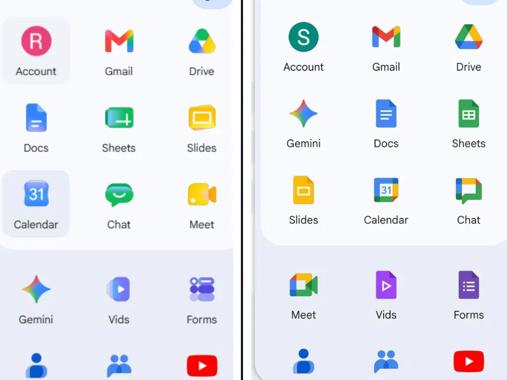
Google近日面向用户开始推送一套全新的 Workspace 应用图标,包括 Gmail、Docs、Sheets、Slides、Drive、Chat、Meet、Calendar、Keep 等常用服务,其整体设计语言更靠近一年前上线的新版Google主标志,全面采用柔和的颜色渐变和更加圆润的几何造型。这批新图标最早在上月的泄露中现身,如今已经在网页端和部分用户设备上广泛出现,部分用户今天一早就已经注意到图标变化。
与此前大面积采用扁平色块的旧版图标不同,新版 Workspace 图标整体从浅色过渡到深色,呈现出由亮到暗的渐变效果,强化了立体感和层次感。在色彩策略上,一些应用从“彩虹配色”改为单一主色,例如 Google Chat、Meet 和 Calendar,Google希望通过更清晰的主色归属,让不同图标在应用列队中更容易“分门别类”,不过也有用户担心这会让习惯旧设计的人在短期内更难一眼认出对应应用。
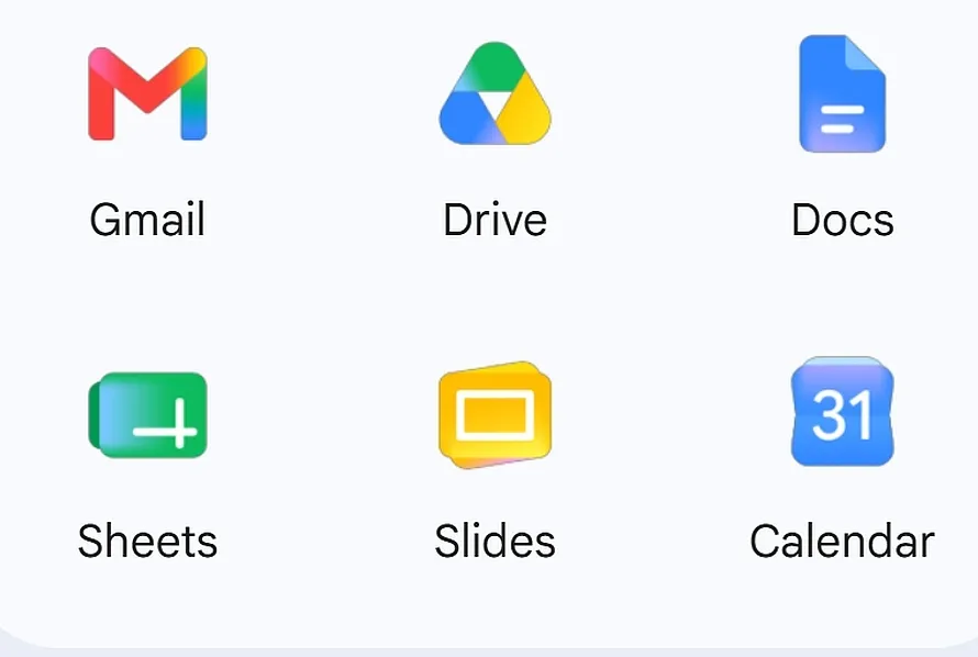
办公套件中的 Google Docs、Sheets 和 Slides 在配色与整体风格上变化相对克制,依旧保留了原有的颜色与基本视觉结构,但在细节上完成了方向与比例调整。有用户在 Reddit 上指出,Sheets 和 Slides 的图标从过去的纵向布局改成了横向布局,这种“横屏化”的设计与大多数用户在实际使用这些应用时以横向表格和横向演示为主的场景更加一致。
变化更为明显的则是云端存储与笔记类应用。Google Drive 图标在这次改版中获得了一次“显著翻新”,标志性的三角形边缘被柔化为圆角,同时取消了右下角原本的一小块红色,使整体观感更加统一、简洁。Google Keep 也不再使用“灯泡置于黄色矩形上的图标边框”方案,而是直接以黄底灯泡图形呈现,视觉上更加直接,但对于长期依赖 Keep 的高频用户来说,完全不同的轮廓可能需要一定时间来重新建立“快速识别”的肌肉记忆。
Gmail 图标在本轮升级中保持了较高的辨识度,并未进行彻底重构,但通过细节收紧和线条优化,整体观感更为干净利落,与 Workspace 其它应用的新图标在风格上更加统一。从整体来看,新图标在色彩和形态上的统一,意在强化“Workspace 家族”的品牌一体性,使用户在桌面或移动端快速浏览多个应用时,能够更直观地识别出属于Google生产力套件的服务。
值得注意的是,这轮图标更新的时间点,恰好选在今年 Google I/O 开幕前夕,外界普遍预计Google将在这场年度开发者大会上公布更多与视觉语言和产品体验相关的更新,Workspace 的图标改版很可能只是整个生态“焕新”的第一步。