on iOS 26In its fourth beta, Apple is once again making changes to the Liquid Glass design throughout the operating system, adjusting how menus and buttons appear in apps.
In response to criticism that there was too little Liquid Glass in beta 3, Apple increased the transparency in several areas.
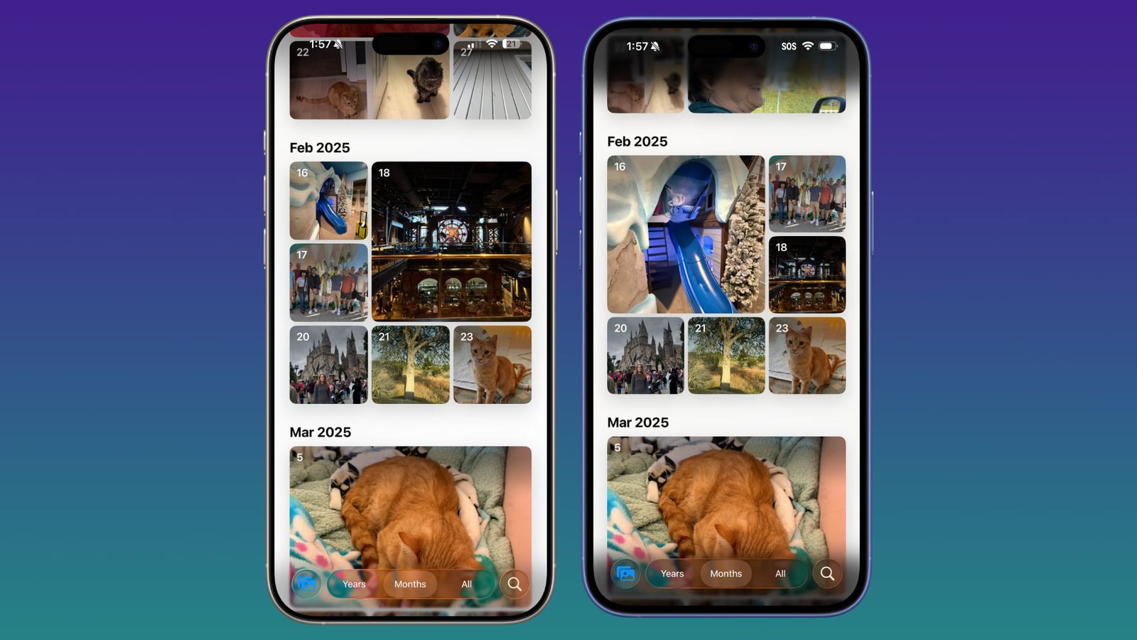
Beta 4 on the left, Beta 3 on the right
The navigation bars in Photos, Music, App Store, Podcasts, and other apps are clearer and can display more background colors.
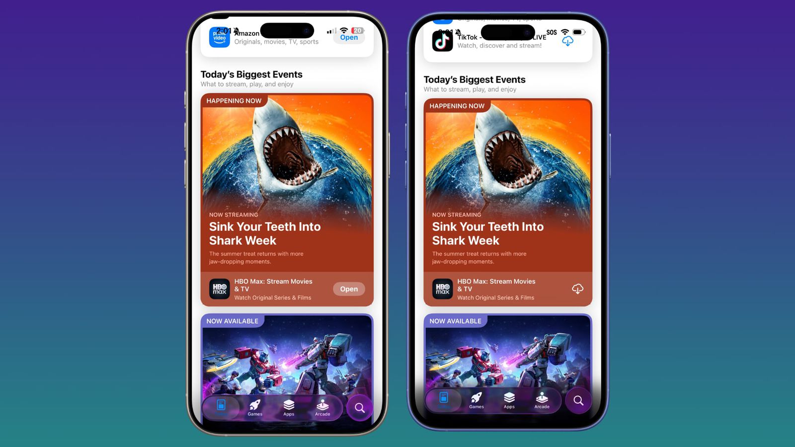
Beta 4 on the left, Beta 3 on the right
Apple has reduced the frosted glass look, but the changes are minimal and text is still readable, so it looks more like a balance between beta 2 and beta 3.
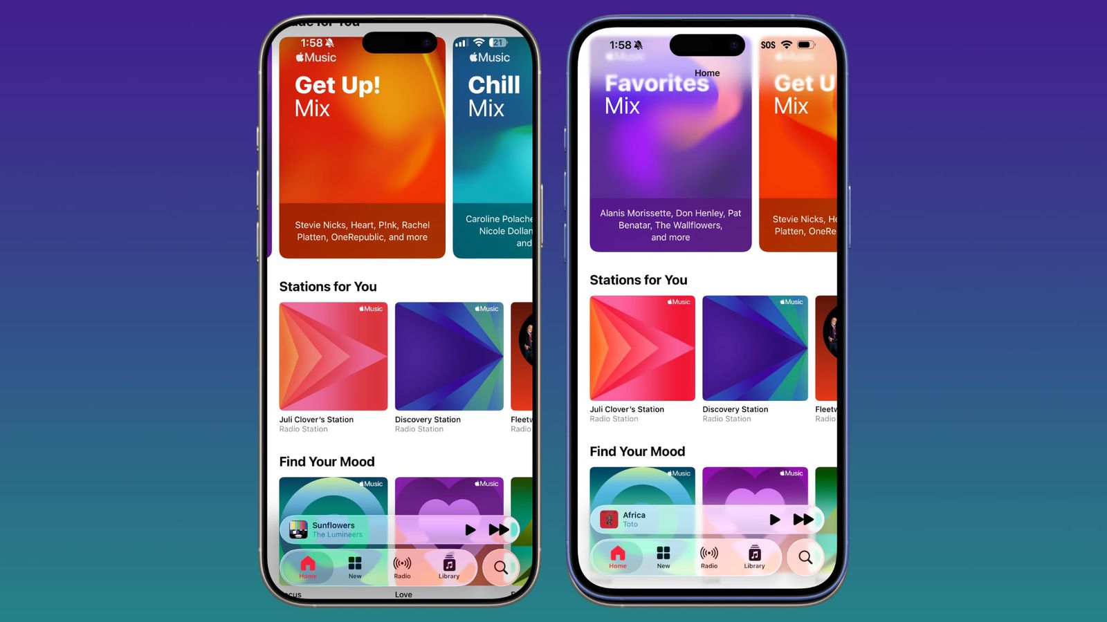
Beta 4 on the left, Beta 3 on the right
The Control Center, Lock screen, and Home screen all look roughly the same, so most of the transparency changes are focused on app navigation bars and buttons. On the lock screen, however, the background darkens when scrolling through notifications.
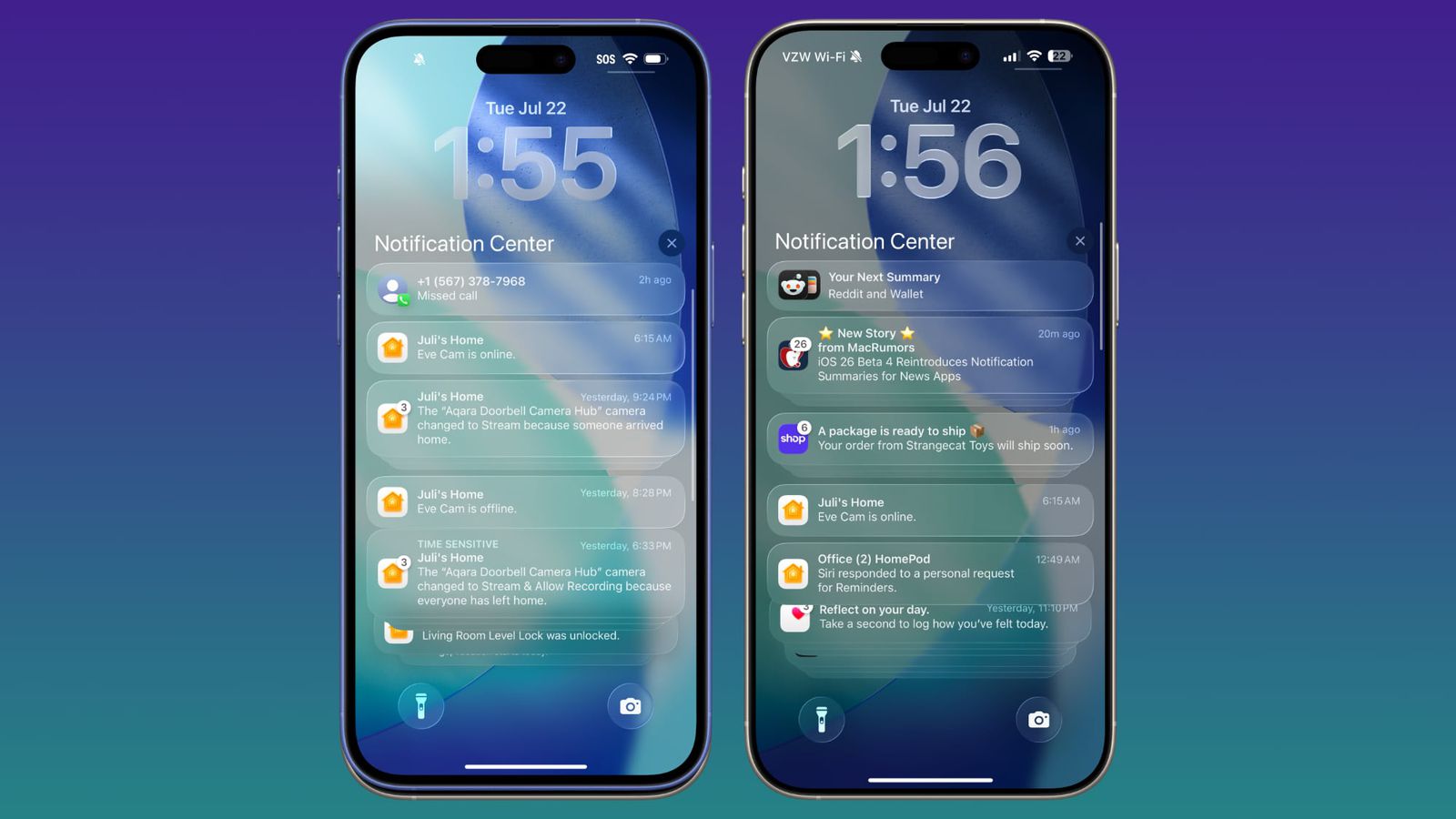
Beta 4 on the right, Beta 3 on the left
Apple may continue to make small changes to Liquid Glass based on user feedback, and we won't see the final version of the design until iOS 26 is released in the fall.