
Abstract:
Microsoft recently introduced in detail the development process behind the new Copilot brand visual design. It seems to be just a simple icon, but in fact the Microsoft design team spent several months trying repeatedly, making a lot of adjustments from graphic structure, fonts, color matching to animation effects, and finally formed the new Copilot visual image today.
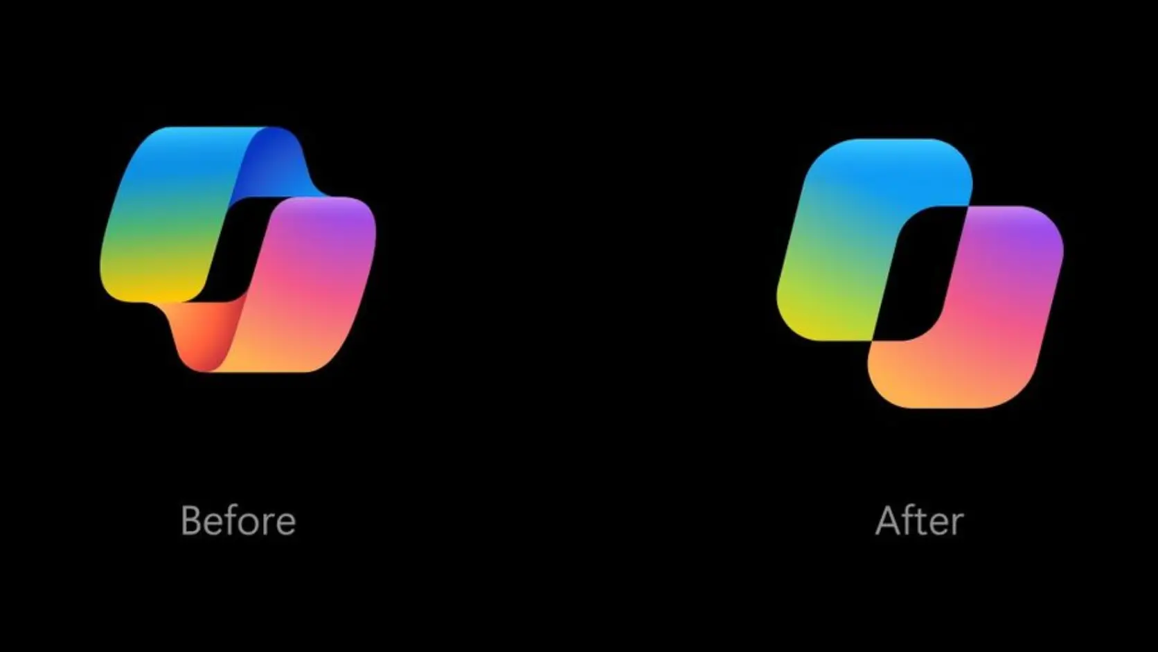
Microsoft said that one of the biggest differences between Copilot and traditional software is that users will continue to dialogue with the artificial intelligence model and receive feedback upon request. Therefore, the Copilot icon, which is always present in the interface throughout the interaction, should not be just a static logo, but should become part of the conversation and even be able to communicate with the user through visual changes.
The design team initially started with a simple square, then further explored shapes made of two squares. Two separate shapes can be understood as different elements coming together to form a more useful, harmonious and powerful whole. After much experimentation, the designers finally found a way to combine the two figures in a way that allowed them to form a unified silhouette and move around each other while maintaining a visual connection.
Copilot’s new wordmark has also been redesigned. Microsoft combined Segoe and Segoe Serif fonts, hoping to add a certain personality to the brand while maintaining legibility. The design team also made extensive adjustments to font proportions and details.
Color planning is another time-consuming step. The Microsoft design team tried a variety of color combinations that looked very beautiful in a stand-alone environment, but many of them were not coordinated with Microsoft's overall product ecosystem, so they had to be revised repeatedly. In order to confirm the actual visual effect, the team even printed different versions of the icon on paper for comparison, and continued to discuss details such as the thickness of the curve. Some design plans may have been discussed one day and abandoned directly the next day.
Microsoft said that the visual design itself involved multiple designers and other related personnel and continued for several months.
One of the most noteworthy parts of this redesign is that the Copilot icon is no longer just a fixed visual element, but will animate differently depending on the task the AI is currently performing.
For example, when Copilot is in the "Thinking" stage, the icon will adopt the corresponding animation effect; after entering the "Planning" stage, the animation will change; and in the "Retrieval" stage, the icon will also use different visual feedback to tell the user that the system is performing the corresponding operation.
This design is not limited to Copilot's main interface. Microsoft has also applied similar status animations to other Copilot products such as Office. Therefore, users can roughly understand whether Copilot is currently thinking about problems, formulating plans, or retrieving information through changes in icons, without simply waiting for text results to appear.
Microsoft believes that as the capabilities of artificial intelligence models continue to improve, the functions that AI can achieve will continue to increase, and the role of design is to transform these technical capabilities into specific forms that users can understand, perceive, and integrate into daily life. For Microsoft, Copilot's new icon is therefore not just a brand logo update, but also hopes to make the interaction between artificial intelligence and users more intuitive through dynamic visual language.
Comments